Create Your First Project
Start adding your projects to your portfolio. Click on "Manage Projects" to get started
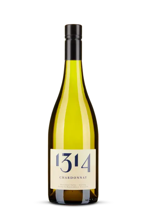
BANNOCKBURN 1314
CLIENT
Bannockburn Vineyards
PROJECT TYPE
Branding and Identity Design, Product Packaging - Wine Labels
CREDITS
Design Execution & Creative Direction by Foundry.
We were approached by Bannockburn Vineyards to elevate the branding of their 1314 wine range, aiming to achieve a more premium and polished look while maintaining the range's approachable and vibrant character. Crafted from estate-grown fruit, the 1314 wines are made for early enjoyment and reflect the meticulous care of the winemaking process. Our redesign sought to harmonise the brand’s heritage with a contemporary, sophisticated appeal.
The updated colour palette plays a key role in distinguishing each wine while maintaining a cohesive overall look. Amethyst Purple for Rosé, Midnight Navy for Chardonnay, Hunter Green for Shiraz, and Imperial Navy for Pinot Noir, paired with a consistent Cream type, gives each label a refined, premium feel. The typography was carefully chosen to reflect the wines’ elegance while remaining accessible, with a modern serif font that balances sophistication with approachability.
The 1314 label also pays homage to Bannockburn’s local Scottish heritage, subtly referencing the Battle of Bannockburn in 1314. This redesign blends modern design sensibilities with a deep connection to the region, creating a memorable and polished visual identity that reflects the care, quality, and rich history behind the 1314 wine range.


